
Insights Dashboard
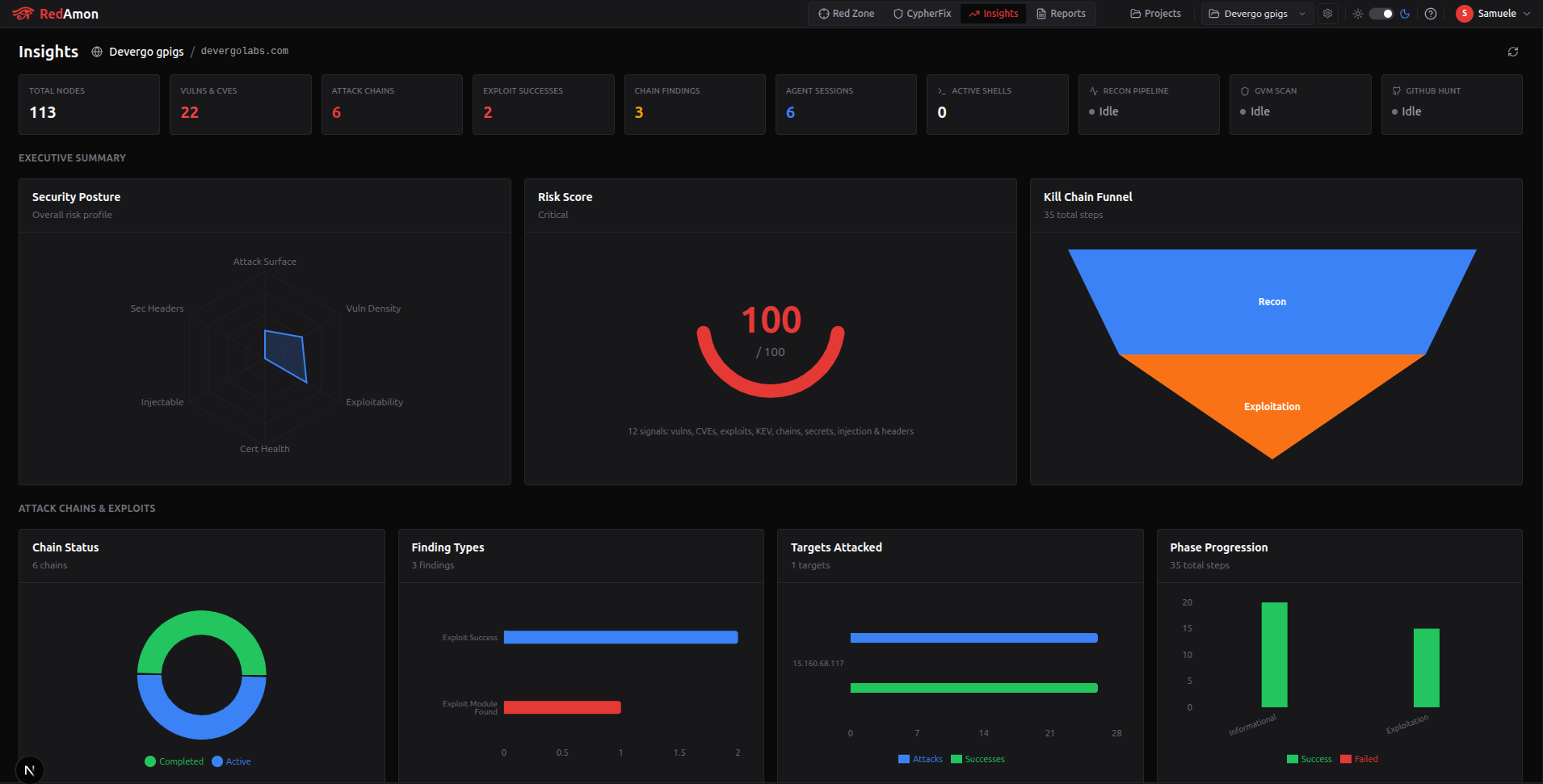
The Insights Dashboard (/insights) provides a comprehensive analytics view of your project's security posture. It aggregates data from reconnaissance, vulnerability scanning, AI agent activity, and attack chain execution into interactive charts, KPI cards, and detailed tables — giving you a single-pane-of-glass overview of your entire engagement.
Accessing the Insights Dashboard
- Select a project from the Project Selector in the top navigation bar
- Click "Insights" (the trending-up icon) in the navigation bar
- The dashboard loads all analytics data for the selected project
If no project is selected, a prompt will guide you to the Projects page.
Dashboard Header
The header displays the project name, target domain (or IP mode indicator), and a Refresh button to manually reload all analytics data. A loading indicator appears while data is being fetched.
KPI Cards
The top row shows 10 cards summarizing key metrics at a glance. These update in real time and provide immediate situational awareness.
| Card | Description |
|---|---|
| Total Nodes | Total number of nodes in the project's attack surface graph (domains, IPs, services, vulnerabilities, etc.) |
| Vulns & CVEs | Combined count of all vulnerabilities and CVEs discovered across all scanning sources |
| Attack Chains | Number of AI-driven attack chains executed against the target |
| Exploit Successes | Number of successful exploits achieved by the AI agent (findings of type exploit_success) |
| Chain Findings | Total findings produced by all attack chain steps (credential leaks, misconfigurations, exploit results, etc.) |
| Agent Sessions | Number of AI agent conversations conducted for this project |
| Active Shells | Currently open remote shells (Meterpreter, command shells, and non-Metasploit sessions). Turns green when shells are active |
| Recon Pipeline | Live status of the reconnaissance pipeline (idle, running, paused, completed, error) with current phase indicator |
| GVM Scan | Live status of the GVM/OpenVAS vulnerability scan |
| GitHub Hunt | Live status of the GitHub secret hunting module |
The pipeline status cards show a colored dot indicator:
- Gray — Idle
- Blue (blinking) — Running or Starting
- Green — Completed
- Red — Error or Failed
- Yellow — Paused
Executive Summary
The first section below the KPI cards provides a high-level risk overview through three complementary charts. Together they answer: how exposed are we?, how bad is it?, and how far did attackers get?
Security Posture (Radar)
A 6-axis radar chart showing the overall risk profile normalized to 0–100 on each axis. Each axis uses logarithmic normalization (min(100, scale × ln(value + 1))) so that both small and large targets produce meaningful scores without saturation.
| Axis | What it measures | Data sources | Scale factor |
|---|---|---|---|
| Attack Surface | Total exposed footprint | Subdomains + IPs + open ports + BaseURLs + endpoints + parameters + technologies | k=13 |
| Vuln Density | Volume of discovered weaknesses | Vulnerability nodes (nuclei/GVM/security checks) + CVE nodes + GitHub secrets + sensitive files + chain findings | k=15 |
| Exploitability | How weaponizable the findings are | GVM confirmed exploits + AI agent exploit successes + CISA KEV entries + CVEs with CAPEC attack patterns | k=25 |
| Cert Health | TLS certificate validity | (healthy certs / total certs) × 100 where healthy = not expired and not expiring within 30 days. Certs from both BaseURL and IP paths. Higher = better | linear % |
| Injectable | DAST-confirmed injection surface | (injectable params / total params) × 100 across all parameter positions. Only set when a Vulnerability→AFFECTS_PARAMETER→Parameter relationship exists | linear % |
| Sec Headers | Defensive header coverage | Weighted coverage of 7 security headers across all BaseURLs. Weights: HSTS (3), CSP (3), X-Frame-Options (2), X-Content-Type-Options (2), X-XSS-Protection (1), Referrer-Policy (1), Permissions-Policy (1). Formula: weighted_sum / total_weight × 100 | weighted % |
Reading the radar: Attack Surface, Vuln Density, Exploitability, and Injectable are "higher = worse" axes. Cert Health and Sec Headers are "higher = better" axes. A compact shape close to the center indicates a well-defended target.
Risk Score (Gauge)
A single composite score from 0 to 100 displayed as a semicircle gauge. It aggregates 12 weighted risk signals into one number using a logarithmic scale: score = min(100, 15 × ln(raw + 1)).
| # | Signal | Weight | Source |
|---|---|---|---|
| 1 | Vulnerability findings × severity | critical=40, high=20, medium=5, low=1 | Nuclei, GVM, security checks — severityDistribution |
| 2 | CVE nodes × severity | critical=40, high=20, medium=5, low=1 | CVE severity from cveSeverity |
| 3 | GVM exploits (QoD=100, confirmed) | ×100 each | ExploitGvm nodes |
| 4 | CISA KEV entries (exploited in the wild) | ×120 each | Exploits where cisaKev=true |
| 5 | Chain exploit successes (agent exploited it) | ×100 each | ChainFinding with finding_type=exploit_success |
| 6 | Chain findings × severity | critical=40, high=20, medium=5, low=1 | Non-exploit chain findings (credential_found, access_gained, etc.) |
| 7 | CVEs with CAPEC attack patterns | ×15 each | CVEs linked through CWE→CAPEC chain (more actionable) |
| 8 | GitHub secrets (direct credential exposure) | ×60 each | API keys, tokens, passwords found in repos |
| 9 | GitHub sensitive files (indirect exposure) | ×30 each | .env files, config files, private keys |
| 10 | Injectable parameters (DAST-confirmed) | ×25 each | Parameters with confirmed injection vulnerabilities |
| 11 | Expired certificates (MITM risk) | ×10 each | Certificates past their not_after date |
| 12 | Missing security headers (defensive weakness) | up to ×5 per header | Penalty for each of 4 critical headers (HSTS, CSP, X-Frame-Options, X-Content-Type-Options) not deployed across BaseURLs |
Score thresholds:
| Score | Label | Color |
|---|---|---|
| 80–100 | Critical | Red |
| 60–79 | High | Orange |
| 40–59 | Medium | Amber |
| 20–39 | Low | Blue |
| 0–19 | Minimal | Green |
The logarithmic scale means the first few findings raise the score rapidly, but it progressively takes more risk signals to push higher. A score of 100 indicates severe, multi-vector exposure.
Kill Chain Funnel
A funnel chart showing how many attack chain steps were executed at each phase of the kill chain, visualizing the narrowing from reconnaissance through exploitation to post-exploitation.
| Phase | Color | Description |
|---|---|---|
| Recon (informational) | Blue | Initial reconnaissance and enumeration steps |
| Exploitation | Orange | Active exploitation attempts against discovered targets |
| Post-Exploit | Red | Post-exploitation activities (privilege escalation, lateral movement, data exfiltration) |
Each funnel segment shows the total steps for that phase. Hover to see how many steps succeeded versus total. A wide top narrowing to a small bottom indicates strong defenses; a wide funnel throughout indicates the agent progressed easily through all phases.
The funnel data comes from
AttackChain → ChainStepphase progression. If no attack chains have been run, this chart shows "No data available."
Attack Chains & Exploits
This is the most data-rich section, covering all aspects of AI-driven attack chain execution. It draws data from six node types: AttackChain, ChainStep, ChainFinding, ChainDecision, ChainFailure, and ExploitGvm.
Row 1 — Chain Overview (4 charts)
Chain Success Rate (Donut)
A donut chart showing the distribution of attack chain statuses (e.g., completed, running, failed, aborted). Provides a quick read on how many chains reached their objectives versus those that stalled or failed.
Finding Types (Horizontal Bar)
Breaks down all chain findings by their type — such as exploit_success, credential_found, info_disclosure, misconfiguration, and others. Each bar is colored by finding type, making it easy to see what classes of findings the agent is producing.
Finding Severity (Donut)
A severity donut (critical / high / medium / low / info) specifically for chain findings, separate from the vulnerability severity in the Vulnerabilities section. Shows how severe the agent's findings are.
Phase Progression (Stacked Bar)
Shows how many steps were executed in each attack phase (informational, exploitation, post_exploitation) and how many succeeded. Each phase shows a stacked bar with total steps and successful steps, revealing where the agent is spending effort and where it succeeds.
Row 2 — Exploits & Targeting (4 panels)
Exploit Successes (Card List — spans 2 columns)
A detailed card list of every successful exploit achieved by the AI agent. Each card displays:
| Field | Description |
|---|---|
| Title | Description of the exploit |
| Target | IP address and port targeted |
| Module | Metasploit module used (if applicable) |
| Payload | Payload delivered |
| Attack Type | Category of the attack |
| CVEs | Related CVE identifiers (shown as badges) |
| Evidence | Truncated evidence output from the exploit |
This card only appears when exploit successes exist.
Strategic Decisions (Donut)
Shows the breakdown of AI agent decisions by type — such as escalate, pivot, skip, retry, abort. Reveals the agent's strategic reasoning patterns during chain execution.
Targets Attacked (Horizontal Bar)
Displays the most-attacked targets (hosts/IPs) with dual metrics: total attack steps directed at each target and how many succeeded. Helps identify which targets received the most attention from the agent.
Row 3 — GVM Exploits (conditional)
GVM Exploits (Card List)
Only shown when GVM-confirmed exploits exist. Lists each exploit with:
| Field | Description |
|---|---|
| Name | Exploit/vulnerability name |
| Target | IP and port |
| CVSS Score | Severity score with color-coded badge |
| Family | Vulnerability family classification |
| CVEs | Associated CVE identifiers |
| CISA KEV | Badge indicating if the vulnerability is in CISA's Known Exploited Vulnerabilities catalog |
| Evidence | Exploit evidence output |
Row 4 — Top Findings Table
A sortable table of the top 20 chain findings, ranked by severity. Columns include:
| Column | Description |
|---|---|
| Node ID | The finding's graph id; click to copy, then ask the agent about it. See Node ID and Mute columns |
| Severity | Color-coded badge (critical, high, medium, low, info) |
| Title | Finding title/description |
| Type | Finding type classification |
| Target | Target host or IP |
| Phase | Attack phase when the finding was produced |
| Evidence | The first 80 characters of the evidence; hover for the full text |
Row 5 — Attack Flow Visualizations (2 full-width Sankey diagrams)
Attack CVE Flow (Custom SVG Sankey)
A 4-column Sankey diagram visualizing theoretical vulnerability chains from the CVE intelligence graph:
Technology → CVE → CWE → CAPEC
| Column | Node Source | Description |
|---|---|---|
| Technology | Technology nodes | Technologies detected on the target (Apache, PHP, jQuery, etc.) |
| CVE | CVE nodes via Technology-[:HAS_KNOWN_CVE]->CVE | Known CVEs affecting each technology |
| CWE | MitreData nodes via CVE-[:HAS_CWE]->MitreData | Common Weakness Enumeration patterns |
| CAPEC | Capec nodes via MitreData-[:HAS_CAPEC]->Capec | Attack patterns that exploit those weaknesses |
Link width represents connection frequency. Hover any node to highlight connected paths. Top 10 nodes per column are shown.
This shows what could be attacked based on known vulnerability intelligence.
Attack Execution Flow (Custom SVG Sankey)
A 4-column Sankey diagram visualizing actual attack chain execution paths:
Target → Tool → Finding → Severity
| Column | Node Source | Description |
|---|---|---|
| Target | ChainStep-[:STEP_TARGETED]->IP/Subdomain, or ChainFinding.target_host | IP/hostname that was actually attacked |
| Tool | ChainStep.tool_name | Tool used (metasploit_console, nmap, openvas, etc.) |
| Finding | ChainFinding.finding_type | What was discovered (exploit_success, credential_found, access_gained, etc.) |
| Severity | ChainFinding.severity | Impact level, colored with standard severity palette |
Also includes GVM-confirmed exploits (ExploitGvm nodes) as openvas → exploit_success → critical flows.
This shows what actually happened during AI agent attack chains and GVM scanning — the real execution trace.
Row 6 — Chain Details & Failures
Attack Chain Cards (wide panel)
Lists each attack chain with its title, status, and metrics (steps, findings, failures). Below the chain list, a Tool Usage table shows which tools the agent used, how many times, and their success rate.
Chain Failures (Horizontal Bar)
Breaks down failure types encountered during chain execution (e.g., timeout, connection_refused, auth_failed, exploit_failed). Helps identify systemic issues or well-defended targets.
Attack Surface
Provides a detailed view of the discovered attack surface from reconnaissance.
Summary Cards (6 cards)
| Card | Description |
|---|---|
| Subdomains | Total discovered, how many resolve to IPs, and unique IP count |
| Endpoints | Total endpoints discovered, base URLs, and parameters found |
| Certificates | Total TLS certificates with expired and expiring-soon counts |
| IPs | Total IP addresses with IPv4/IPv6 breakdown |
| CDN Coverage | How many IPs are behind CDNs vs. direct, and number of CDN providers |
| ASN Diversity | Number of unique Autonomous Systems hosting the target's infrastructure |
Row 1 — Services & Infrastructure (4 charts)
Services (Donut)
Distribution of discovered services (HTTP, HTTPS, SSH, FTP, etc.) showing which service types are most prevalent across the attack surface.
Port Distribution (Horizontal Bar)
Top ports by frequency. Shows which ports are most commonly open across all discovered hosts.
Technology Treemap
A treemap visualization of detected technologies (web servers, frameworks, CMSes, programming languages). Area represents relative prevalence.
DNS Records (Donut)
Breakdown of DNS record types discovered (A, AAAA, CNAME, MX, TXT, NS, etc.).
Row 2 — Headers, CDN & Endpoints (4 charts)
Security Headers (Horizontal Bar)
Shows all HTTP headers found across scanned URLs, colored by whether they are security-relevant headers (green) or standard headers (blue). Based on actual Header nodes and their is_security_header property in the graph.
Header Insights (Donut)
Categorizes discovered headers into groups (security, caching, CORS, content-type, etc.) to show the overall header landscape.
CDN vs Direct (Donut)
Proportion of IPs served through CDN providers versus directly exposed. Useful for understanding how much of the infrastructure is shielded.
Endpoint Categories (Horizontal Bar)
Groups discovered endpoints by category (API, static assets, admin panels, authentication, etc.).
Row 3 — Endpoint & IP Analysis (3 charts)
Endpoint Types (Donut)
Distribution of endpoint types (pages, APIs, resources, redirects, etc.).
Parameter Analysis (Horizontal Bar)
Analyzes discovered parameters by type and context (query parameters, form fields, path parameters) — useful for identifying potential injection points.
IP Concentration (Horizontal Bar)
Shows which IP addresses host the most services/subdomains, revealing infrastructure concentration points.
Vulnerabilities & CVE Intelligence
Aggregates all vulnerability data from GVM scanning, CVE correlation, and other sources.
Row 1 — Severity & Sources (4 charts)
Vulnerability Severity (Donut)
Distribution of vulnerability severity levels (critical, high, medium, low) from all scanning sources.
CVE Severity (Donut)
Severity distribution specifically for matched CVEs, which may differ from vulnerability severity due to CVSS scoring.
CVSS Histogram
Histogram of CVSS scores across all CVEs, showing the score distribution in bins (0-1, 1-2, ... 9-10).
Vulnerability Sources (Donut)
Breakdown of where vulnerabilities were found — GVM scanner, AI agent findings, reconnaissance, etc.
Row 2 — Findings Detail (4 charts)
Findings by Source (Horizontal Bar)
Detailed count of findings per scanning source/tool.
Findings by Category (Horizontal Bar)
Groups findings by vulnerability category (injection, XSS, misconfig, information disclosure, etc.).
CWE Breakdown (Horizontal Bar)
Top CWE (Common Weakness Enumeration) identifiers found across all CVEs, showing the most common weakness patterns.
Vulnerability Targets (Horizontal Bar)
Which hosts/targets have the most vulnerabilities, helping prioritize remediation efforts.
Row 3 — CVE Analysis (2 charts)
CVEs by Technology (Horizontal Bar)
Shows which technologies (and versions) have the most associated CVEs. Bars are colored by the highest severity CVE for that technology. Data from Technology-[:HAS_KNOWN_CVE]->CVE relationships.
Attack Patterns (Horizontal Bar)
CAPEC attack patterns linked to discovered CVEs via the CVE-[:HAS_CWE]->MitreData-[:HAS_CAPEC]->Capec chain, revealing what types of attacks the target is susceptible to.
Row 4 — Advanced CVE Analytics (3 charts)
CVSS vs Exploitability (Scatter Plot)
A Recharts scatter chart plotting each CVE to identify the danger zone — vulnerabilities that are both high-severity AND have known attack patterns.
| Dimension | Mapping | Description |
|---|---|---|
| X-axis | CVE.cvss score (0–10) | CVSS severity score |
| Y-axis | CAPEC count per CVE | Number of attack patterns via CVE→CWE→CAPEC chain |
| Bubble size | CAPEC count | Larger = more attack vectors |
| Color | CVE.severity | Standard severity palette (critical=red, high=orange, etc.) |
| Red ring | Has confirmed exploit | ExploitGvm match via cisaKev or CVE ID lookup |
CVEs are aggregated by unique cveId from the cveChains data. Pentesters should focus on the top-right quadrant (high CVSS + many attack patterns) — especially those with a red ring (confirmed exploitable).
Vulnerability Category Rose (Radial Bar Chart)
A rose/polar diagram showing vulnerability distribution across categories. Each radial bar represents a category (sqli, xss, rce, misconfig, info-disclosure, etc.) with bar height proportional to finding count.
Data source: Vulnerability and SecurityCheck findings grouped by category. Top 8 categories are shown with palette-cycled colors. More visually striking than a standard bar chart for comparing category proportions.
Top Vulnerable Technologies (Bubble Chart)
A bubble chart ranking the 12 riskiest technologies by CVE volume and maximum CVSS score.
| Dimension | Mapping |
|---|---|
| X-axis | Technology rank (1–12 by CVE count) |
| Y-axis | Total CVE count per technology |
| Bubble size | Maximum CVSS score across that technology's CVEs |
| Tooltip | Technology name, CVE count, max CVSS, critical CVE count |
Data aggregated from cveChains: group by tech, count unique cveId, find max cvss. Helps prioritize which technologies to patch or replace first.
Row 5 — Exploits & Remediation (conditional, 3 charts)
Only shown when exploit or GVM remediation data exists.
Known Exploits (Card List)
Lists publicly known exploits matching discovered CVEs, with links, source databases, and severity indicators.
GVM Remediation (Donut)
Breakdown of GVM remediation recommendations by status or type.
CISA KEV Gauge
Shows how many of the discovered vulnerabilities appear in CISA's Known Exploited Vulnerabilities catalog — a critical prioritization metric.
Graph Overview
High-level structural analysis of the project's knowledge graph.
Nodes by Type (Horizontal Bar)
Top 10 node types by count (e.g., Endpoint, Parameter, Header, CVE, IP, Subdomain). Each bar is colored by the node type's palette color.
Most Connected Nodes (Horizontal Bar)
Top 10 nodes ranked by degree centrality (number of relationships). Reveals the most interconnected entities in your attack surface — often the most important targets. Colored by node type.
Activity & Timeline
Tracks operational activity over the engagement timeline.
Remediations Over Time (Area Chart)
Time-series chart showing when remediations were created, helping track the pace of remediation efforts.
Agent Activity (Line Chart)
Timeline of AI agent conversations, showing when the agent was most active during the engagement.
Remediation Status (Horizontal Bar)
Breakdown of remediations by their current status (pending, in progress, verified, etc.).
Row 2 — Vulnerability Accumulation
Vulnerability Accumulation Over Time (Stacked Area Chart)
A Recharts stacked area chart showing cumulative vulnerability discovery over time, segmented by severity level.
| Dimension | Mapping |
|---|---|
| X-axis | Date (from remediation timeline) |
| Y-axis | Vulnerability count |
| Stacked areas | critical (red), high (orange), medium (amber), low (blue) |
Severity keys are dynamically detected from the data (any key besides date and count). Each area uses a gradient fill for visual depth.
Shows whether vulnerability discovery is accelerating or plateauing — key for tracking pentest progress. A flat line indicates scanning has reached diminishing returns; a steep rise means new attack vectors are still being found.
GitHub Intelligence (conditional)
Only shown when GitHub secret hunting has been performed and produced results.
| Card | Description |
|---|---|
| Repos Scanned | Number of GitHub repositories analyzed |
| Secrets Found | Number of exposed secrets discovered (API keys, tokens, passwords). Highlighted in red |
| Sensitive Files | Number of sensitive files identified (configs, private keys, credential files). Highlighted in yellow |
Data Freshness & Auto-Refresh
- All data hooks use React Query with configurable stale times (typically 30 seconds)
- The Active Shells card refreshes every 15 seconds automatically
- Pipeline status cards update in near real-time via polling
- Use the Refresh button in the header to force-reload all sections simultaneously
Data Sources & Graph Schema
The Insights Dashboard pulls data from four API endpoints, each querying the Neo4j graph and/or PostgreSQL database:
| API Endpoint | Source | Key Node Types / Tables |
|---|---|---|
/api/analytics/graph-overview | Neo4j | All nodes (counts by label), Subdomain, IP, BaseURL, Endpoint, Parameter, Certificate, degree centrality |
/api/analytics/attack-surface | Neo4j | Service, Port, Technology, Header, DnsRecord, Endpoint, Parameter (injectable flag), IP (CDN/ASN) |
/api/analytics/vulnerabilities | Neo4j | Vulnerability, CVE, MitreData (CWE), Capec, ExploitGvm, GithubSecret, GithubSensitiveFile |
/api/analytics/attack-chains | Neo4j | AttackChain, ChainStep, ChainFinding, ChainDecision, ChainFailure, ExploitGvm |
/api/analytics/activity | PostgreSQL | Remediation (severity, status, category, timeline), Conversation (agent sessions) |
/api/analytics/pipeline-status | PostgreSQL | Recon/GVM/GitHub pipeline status |
Key Graph Relationships Used
Technology -[:HAS_KNOWN_CVE]-> CVE -[:HAS_CWE]-> MitreData -[:HAS_CAPEC]-> Capec
IP -[:HAS_PORT]-> Port -[:RUNS_SERVICE]-> Service
BaseURL -[:HAS_ENDPOINT]-> Endpoint -[:HAS_PARAMETER]-> Parameter
Vulnerability -[:AFFECTS_PARAMETER]-> Parameter  (marks injectable)
BaseURL -[:HAS_CERTIFICATE]-> Certificate
IP -[:HAS_CERTIFICATE]-> Certificate  (GVM-discovered)
BaseURL -[:HAS_HEADER]-> Header  (is_security_header flag)
AttackChain -[:HAS_STEP]-> ChainStep -[:PRODUCED]-> ChainFinding
ChainStep -[:STEP_TARGETED]-> IP/Subdomain/Port
ChainStep -[:STEP_EXPLOITED]-> CVE
ChainStep -[:STEP_IDENTIFIED]-> Technology
ChainFinding -[:FOUND_ON]-> IP/Subdomain
ChainFinding -[:FINDING_RELATES_CVE]-> CVE
ExploitGvm -[:EXPLOITED_CVE]-> CVE
Chart Types Summary
| Chart Type | Implementation | Components |
|---|---|---|
| Radar | Recharts RadarChart | Security Posture |
| Funnel | Recharts FunnelChart | Kill Chain Funnel |
| Scatter/Bubble | Recharts ScatterChart | CVSS vs Exploitability, Top Vulnerable Technologies |
| Stacked Area | Recharts AreaChart | Vulnerability Accumulation, Remediations Over Time |
| Gauge | Custom SVG arc | Risk Score |
| Sankey | Custom SVG bezier | Attack CVE Flow (Tech→CVE→CWE→CAPEC), Attack Execution Flow (Target→Tool→Finding→Severity) |
| Radial Bar (Rose) | Recharts RadialBarChart | Vulnerability Category Rose |
| Donut/Pie | Recharts PieChart | Severity donuts, CISA KEV Gauge, Service/DNS/CDN pies |
| Bar (Horizontal) | Recharts BarChart | Port distribution, Headers, Findings, CWE, Targets, Phase Progression |
| Histogram | Recharts BarChart | CVSS Histogram |
| Line | Recharts LineChart | Agent Activity |
| Treemap | Custom SVG | Technology Treemap |
Tips
- Empty states: Charts gracefully show "No data available" when there is no data for that metric. This is normal for a fresh project before running any scans.
- Conditional sections: Some rows (GVM Exploits, Known Exploits, GitHub Intelligence) only appear when relevant data exists, keeping the dashboard clean.
- Tooltips: Hover over any chart bar or segment to see exact values. Tooltips adapt to your current theme (light or dark).
- Color consistency: Node types use consistent colors across all charts (Nodes by Type, Most Connected Nodes, and the Red Zone). Severity levels (critical/high/medium/low) also use a consistent palette throughout.
- Theme support: All charts use
chartTheme.tsutilities (getChartPalette(),getChartChrome(),severityColor()) and respond to light/dark theme changes via theuseThemehook.
Next Steps
- Red Zone — Explore your attack surface visually
- AI Agent Guide — Learn how the AI agent executes attack chains
- EvoGraph — Attack Chain Evolution — Visualize how attack chains evolve over time
- Agent Skills — Built-in and user-defined agent skill workflows